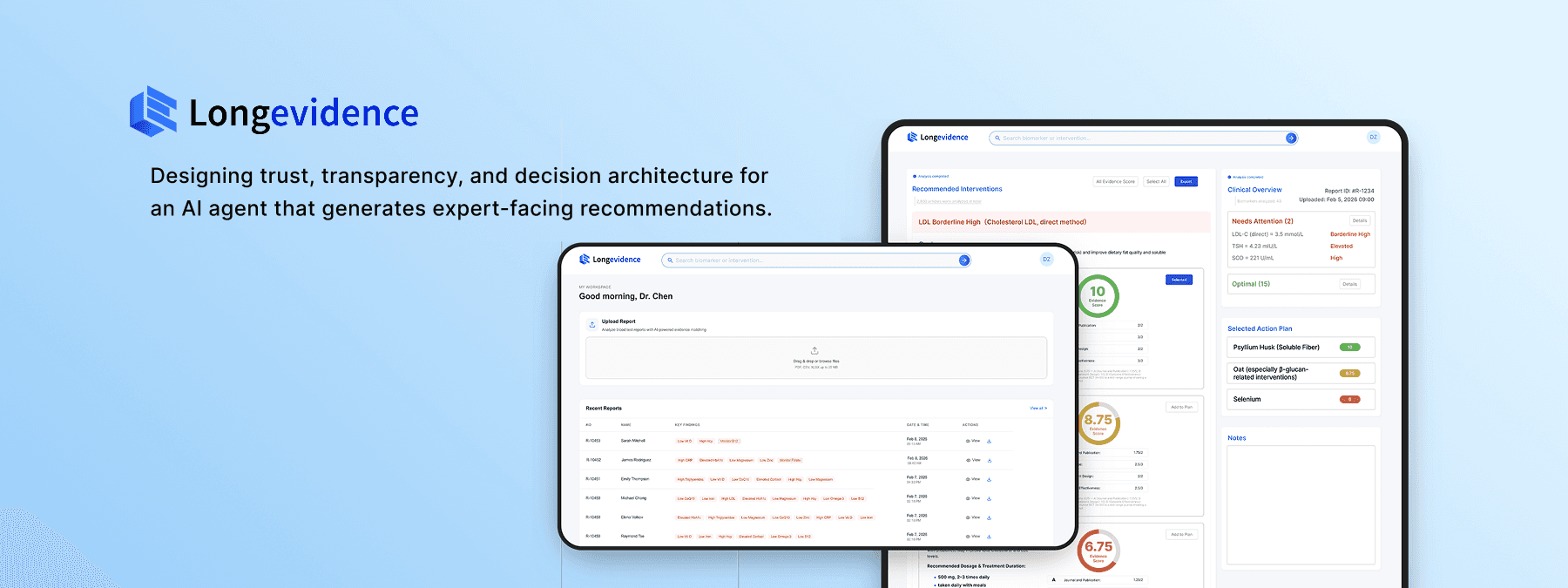

Designing trust, transparency, and decision architecture for an AI agent that generates expert-facing recommendations.
Applied to Longevidence — a clinical AI platform that turns patient biomarker data into evidence-scored action plans for physicians.
0→1 Product Definition
Product Strategy
AI Trust & Transparency
Human-in-the-Loop Design
Non-deterministic Output Design
Sole Designer
From Designer to Fundraising Strategist
Product Form Signaling
Upload-first hierarchy communicates platform category on first contact

Human-in-the-Loop Decision Architecture
AI recommendations, evidence scoring, and physician customization in one workflow
AI Pipeline Transparency
Progressive disclosure of each reasoning stage builds trust before output
Auditability Chain
User verifies the basis of a recommendation
In 0→1 AI products, the most consequential design decision is often the first one: what is this product's primary interaction form?
01 Product Context
The Strategic Problem:
When Product Form Is Undefined, Every Downstream Design Decision Carries Compounding Risk
This decision determines information architecture, competitive positioning, and business model viability. Getting it wrong means building an entire product on misaligned foundations.

Physicians spend hours manually assembling evidence-based action plans for each patient.
Constraint 1
No existing tool automates the full pathway from patient report to action plan.
Constraint 2
The company had validated market demand through a prior hospital deployment; the next milestone required a product that could demonstrate scalable value — and Longevidence was that product.
I joined as
the sole designer.
Within the first week, I identified that the team had not resolved a prerequisite
question:
what category of product Longevidence actually was.
I encountered this problem at QuantumLife, a longevity medicine startup building Longevidence — a clinical AI platform. The product — an AI agent that autonomously generates evidence-scored action plans from patient data — had no precedent in any medical field. There was no established product pattern to reference, no existing interaction model to adapt.
02 My Role & Scope
I led product strategy and end-to-end interface design as the designer on the project. For Longevidence, I independently drove:
✍️Resolving product form ambiguity
🔍Designing trust for non-deterministic AI output
👤Enterprise Admin System Design
📇Design System
🧩Structuring human-AI decision workflows
🏥Building auditability into AI recommendations
As sole designer reporting directly to the CEO, I owned the complete design lifecycle — from product definition through developer handoff — delivering a functional platform in three months.
03 Diagnosing a Category-Level Product Conflict Before It Became a Technical Debt
The team was building two different products without realizing it. I made the conflict visible.
The team had no written agreement on what Longevidence actually was. Requirements existed as verbal conversations and implicit assumptions — a setup where engineering, design, and business could each be building toward a different product without realizing it. I initiated a product definition process to make these assumptions explicit before committing design resources.

Undocumented requirements create compounding alignment risk. If I had started designing interfaces based on verbal briefings alone, I could have built a complete product that the team would later realize was the wrong product.
An all-in-one clinical platform
Report Upload
Evidence Synthesis
Physician Customization
Biomarker Extraction
Supplement Recommendations
Automated Action Plan Generation
I designed an initial low-fi based on the understanding:


When I presented the initial design to the team, the technical lead's feedback revealed something unexpected: he wasn't requesting a design change — he was describing a fundamentally different product. His reference model was examine.com, a search-first evidence platform. The documented vision described an action-plan-first clinical workflow. These weren't two design directions. They were two different product categories.
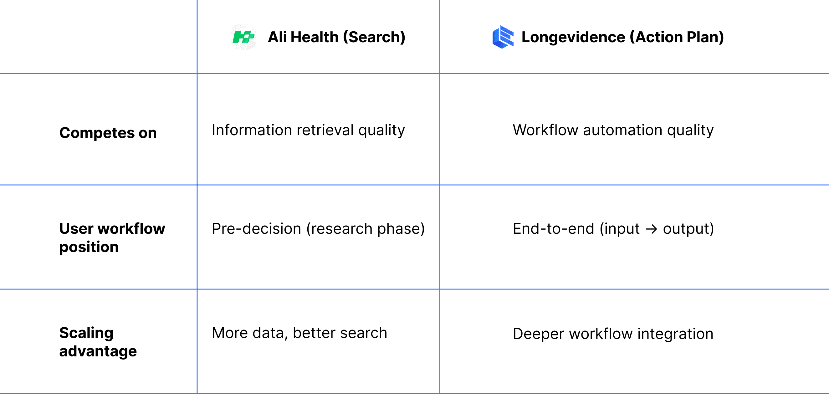
I diagnosed this as a product category conflict, not a design feedback issue. To make the implications of each direction concrete and comparable, I mapped both architectures against five business dimensions that would be directly affected by the choice:
The table made visible what verbal discussions could not: the two directions weren't just different UX approaches — they implied different value propositions, different competitive benchmarks, and different revenue models.
Competitive risk assessment of the search architecture:
The action plan product form eliminates both risks. It occupies a workflow automation category that neither examine.com nor OpenEvidence operates in.
Both product forms share the same core functions — search, report upload, evidence display, action plan generation. The question is which function leads. Different emphasis produces different product positioning, different competitive dynamics, and different investor narratives. A search-led product enters OpenEvidence's category. An upload-led product defines a new one.
I brought this analysis directly to the CEO with a specific recommendation: resolve the product form question before any further design or engineering investment. Every week spent building interfaces for an undecided product form was a week of potentially irreversible technical debt.
04 Resolving a Strategic Impasse Through Design: Using Prototypes as Decision Instruments
The Team Had Two Competing Visions. I Designed an Experiment to Let Users Decide.
The product form question could not be resolved through internal discussion — the team held conflicting assumptions about how physicians would actually use the platform. I proposed resolving it empirically: build both architectures as functional prototypes and let physicians demonstrate their preference through actual usage, not stated opinion.
I designed the test methodology, built both prototypes, and structured the evaluation to isolate a single variable: which product architecture matches physician workflow.
Defining the test variable:
The real question was which product architecture matches physician workflow needs. This determined what I built and how I controlled for bias. I needed to compare mental models: does the physician want to drive the synthesis process (search) or validate an automated synthesis (action plan)?
In any AI product, the user's relationship to the AI's output falls on a spectrum: from active construction (user drives, AI assists) to active validation (AI generates, user reviews). Where a product sits on this spectrum determines its entire interaction architecture.
For Longevidence, I needed to test which end of this spectrum matched physician workflow


Both prototypes implemented identical core functions — search, upload, evidence display, action plan generation.
Same capabilities, different architecture. The test would reveal whether physicians' workflow demanded AI-driven synthesis or self-directed research — a distinction that would determine not just the interface, but the product's competitive category and monetization surface.
Controlling for completion bias &
I brought both prototypes to equivalent completion levels. Users reliably gravitate toward whichever option appears more complete; if Prototype A had richer interactions than B, the test would measure polish preference, not architecture preference.

Result
50+ physicians tested over two weeks — a sample size unusual for prototype-stage validation, made possible by QuantumLife's clinical network.
85%+
Prototype A
showed clear preference for the action plan architecture
The result was decisive: physicians overwhelmingly preferred the action plan architecture. They did not want to drive the research process — they wanted to validate and customize an AI-generated synthesis.
05 Market Confirmation
Market Validation: A $200B Incumbent Launched the Architecture We Had Just Rejected
In early-stage product strategy, the highest-risk scenario is building a product that competes directly with a resource-dominant incumbent on their strongest axis. The product form test was designed to avoid exactly this.
Three days after the product form was confirmed, Ali Health — Alibaba's healthcare division — launched a clinical evidence search product structurally similar to the architecture we had just rejected.
When Ali Health launched, I immediately mapped the competitive implications: what would our position be if we had chosen the search architecture two weeks earlier?
Direct competition with Alibaba ($200B+ market cap) on information retrieval — the incumbent's strongest dimension. The advantage compounds with scale. A three-person startup has no structural differentiation to prevent displacement.
If QuantumLife had adopted the search architecture
Two weeks of testing prevented what could have been months of building in the wrong direction — against a competitor with functionally unlimited resources.
The validated action plan architecture places Longevidence in a different competitive category entirely. I mapped the positioning:
Overlap
Minimal — different user needs, different workflow stages
This positioning allows Longevidence to grow without triggering competitive response from a resource-dominant player — the ideal strategic condition for an early-stage startup. This strategic outcome originated from a design decision — the choice to test product form before committing to an architecture. Design, in this case, was not downstream of strategy. It was the instrument through which strategy was validated.
It also analysis demonstrates a general principle for AI startups entering markets with dominant incumbents: compete on a different axis of the user workflow, not a better version of the same axis.
06 Design Focus
Designing for Trust, Transparency, and Value Perception in AI Agent Interfaces
Every AI agent that generates autonomous output faces two adoption-critical design challenges.
The user must have sufficient basis to evaluate whether the AI's output is reliable.
Trust Calibration
the user must perceive the AI's processing as substantive — if the output appears to arrive too easily, users discount its value regardless of actual quality.
Work Perception
In most consumer AI contexts, these are parallel problems solved through separate mechanisms — citations for trust, loading animations for perceived effort.
In high-stakes AI applications where output directly drives expert decisions, these challenges converge: the same interface elements must simultaneously establish trust AND communicate the depth of the AI's work.
Longevidence presented this convergence in its most demanding form: physicians would use AI-generated recommendations to make clinical decisions affecting patient care. I identified four design priorities to address these challenges:
1
Product Form Signaling
Homepage information hierarchy communicates product category on first contact
2
Platform Process Transparency
Retrieval breadth (number of studies, participant counts, database coverage) simultaneously communicates agent value and establishes clinical trust: comprehensive retrieval reduces risk of publication bias and population bias in recommendations.
3
Building Verifiable Trust in AI-Generated Recommendations
Every element of the action plan interface serves one purpose: giving physicians sufficient basis to adopt the recommendation. When AI output directly affects patient care, trust is not only a UX preference but also an adoption prerequisite.
4
User Workflow Integration
Interaction design aligned with physician decision-making patterns. Minimizes friction between the agent's output and the physician's clinical judgment process.
1
Product Form Signaling
How information hierarchy on first contact determines product category perception
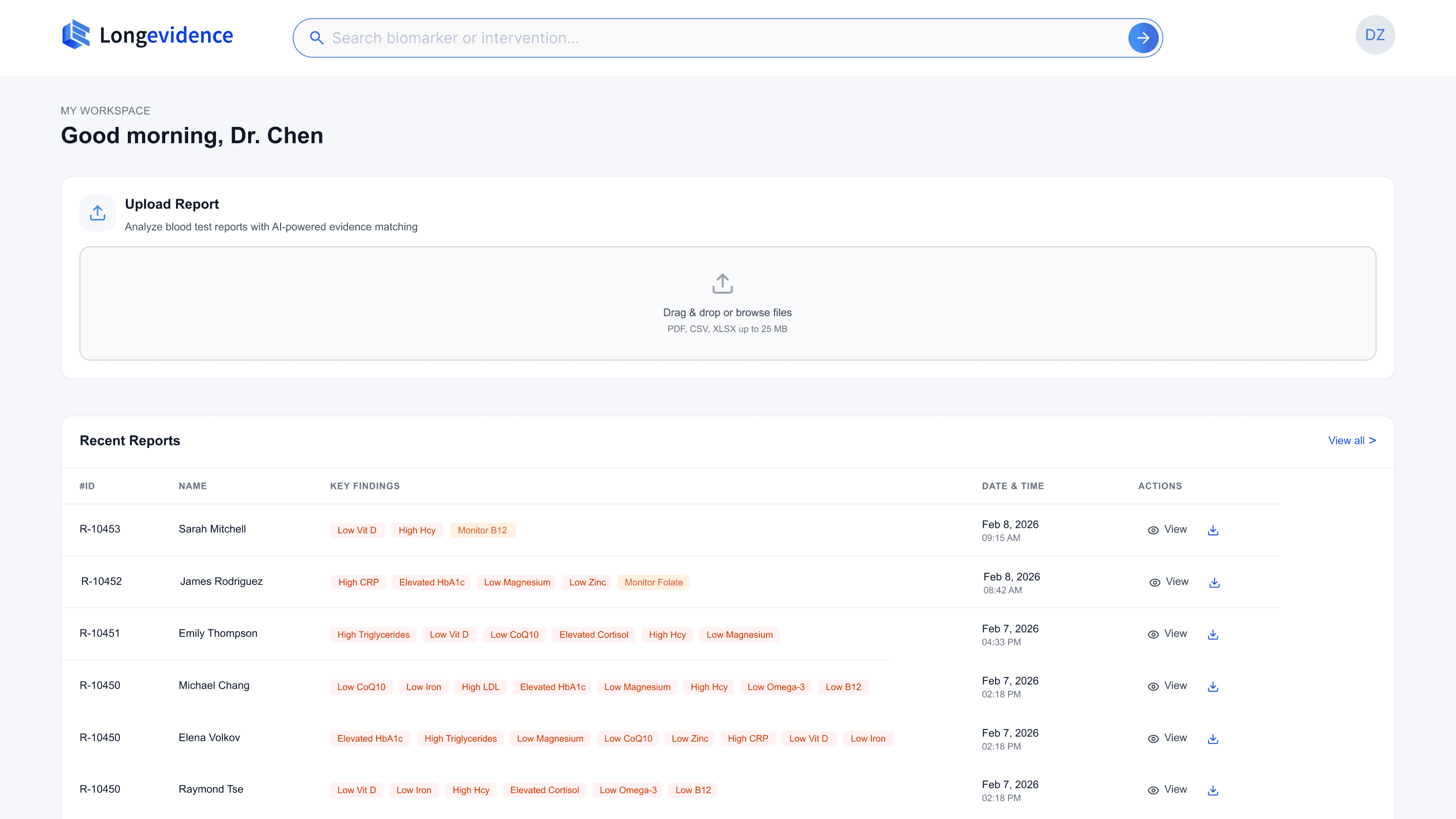
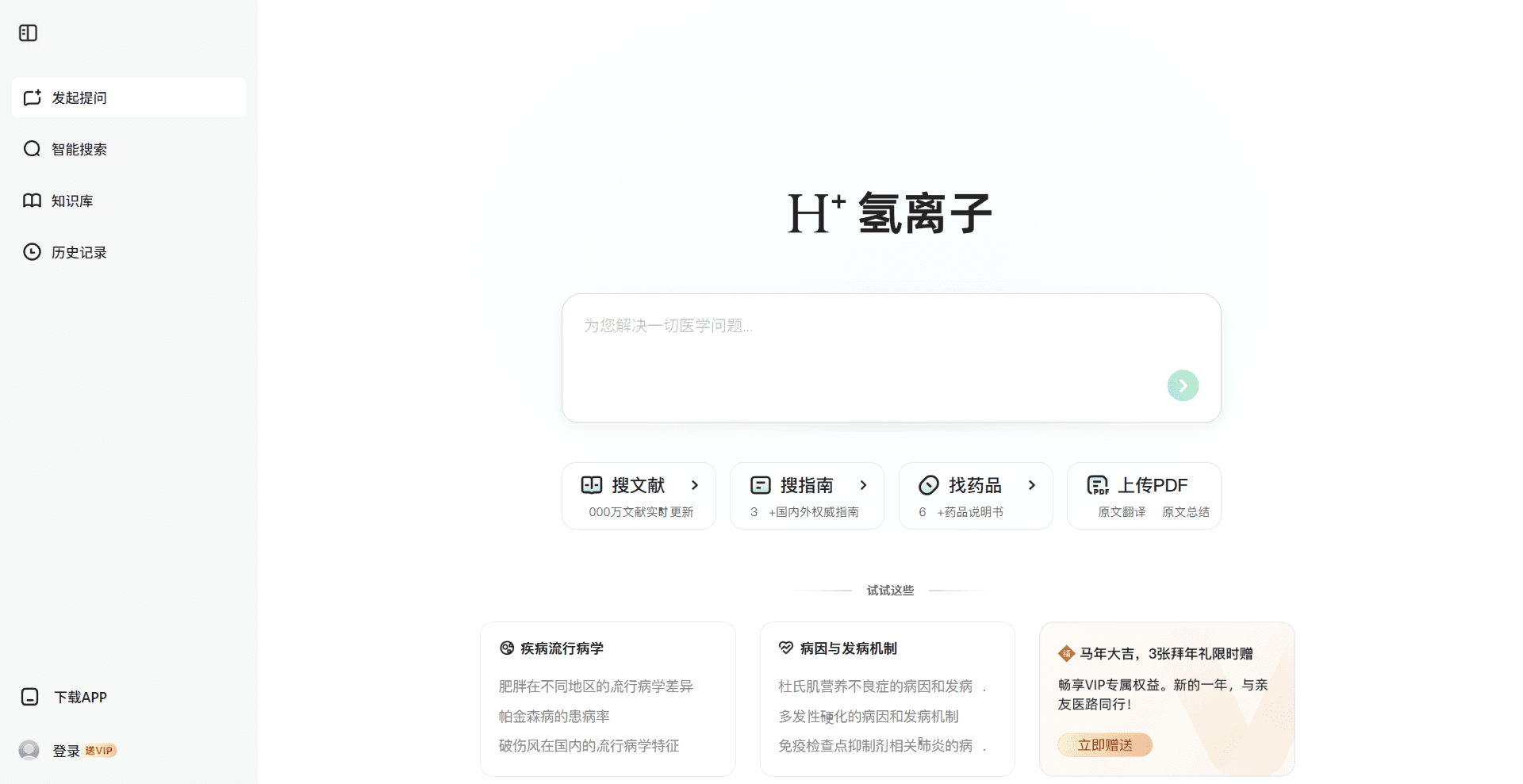
The homepage must communicate the product form immediately — physicians should understand within seconds that this is an upload-first action plan platform, not a search engine.
The design challenge
Most AI products follow a conversational model, centering a search bar or chat interface as the primary entry point. Longevidence's validated product form inverts this convention — upload is the primary action, search is secondary. Currently, rare established AI product pattern exists for this hierarchy.
This meant I could not rely on existing AI product conventions — I needed to derive the hierarchy from first principles by studying how other platforms solve analogous structural problems in non-AI contexts.
My Solution
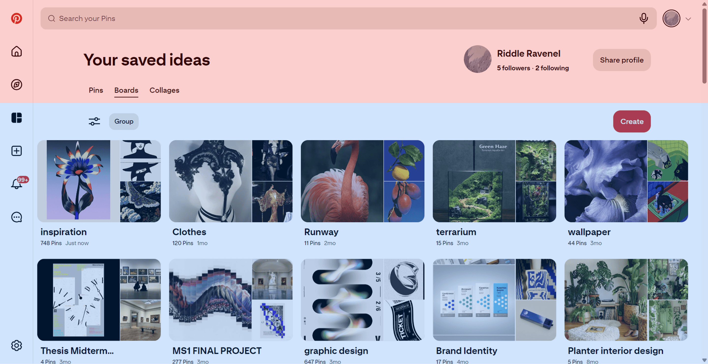
To determine how to structure this unfamiliar hierarchy, I inspired by Pinterest and LinkedIn.
I used functional hierarchy analysis method, deconstructed both into primary action zones (highest-intent behavior, most critical content) and secondary action zones (lower-frequency, supporting actions).


This analysis produced a placement framework I applied to Longevidence: upload occupies the primary action zone, search is positioned in the secondary zone — accessible but subordinate to the core workflow.

2
Platform Process Transparency
The analysis phase is the physician's first encounter with the agent's intelligence. This phase is critical for establishing physician trust in the AI-generated output.
The design challenge
In any AI agent product, the system executes a multi-step pipeline that is invisible to the user by default. The user submits input, waits, and receives output with no basis for evaluating how it was produced. This opacity is the single largest barrier to trust in autonomous AI systems.
For Longevidence, this pipeline involves four stages: report parsing (OCR), biomarker extraction, evidence retrieval across thousands of publications, and evidence scoring. Each stage is computationally substantive — but completely invisible to the physician without deliberate design intervention.
My Solution
I developed a progressive trust framework for multi-stage AI pipelines. The core principle: each stage of the pipeline, when made visible, establishes a distinct type of trust. The sequence matters — earlier stages must establish foundational trust before later stages can build on it.
Stage 1
Accuracy Trust
The system correctly interpreted my input Trust
Capability Trust
Stage 2
The system operates at a scale I cannot replicate manually
Methodological Trust
Stage 3
Recommendations derive from systematic methodology, not arbitrary selection
Utility Expectation
Stage 4
The output will be actionable and relevant to my needs
Phase 1 · Report Parsing

OCR extraction, biomarker identification, abnormal marker flagging. The physician verifies the system correctly interpreted the report, particularly the biomarker chips, which allow immediate confirmation that the right indicators were flagged, establishing accuracy trust.
Phase 2 · Evidence Retrieval

Search terms, matched paper counts, identified supplements. When a physician sees "2,737 papers matched," the perception shifts from "can this system read my report" to "this system searches at a scale I cannot replicate manually." This establishes capability trust.
Phase 3 · Evidence Scoring

The scoring breakdown — Journal and Publication, Study Type, Experiment Design, Outcome Effectiveness — gives physicians a transparent rubric. They can see exactly how each supplement was evaluated, confirming that the ranking reflects systematic analysis, not opaque AI judgment.
Phase 4 · Action Plan Generation

Dosage, treatment duration, drug interaction alerts, consolidated summary. The physician knows the next screen will present a complete, reviewable, and editable plan. This establishes utility expectation.
The transparency framework establishes that the AI's process is trustworthy. The next challenge is ensuring that the AI's individual recommendations are independently verifiable.
3
Building Verifiable Trust in AI-Generated Recommendations
When an AI system generates specific, actionable recommendations, the interface must answer a fundamental question: why should I trust this particular recommendation? Generic confidence scores or vague 'AI-powered' labels are insufficient — expert users need to inspect the reasoning chain behind each recommendation independently.
Every element of the action plan interface serves one purpose: giving physicians sufficient basis to adopt the recommendation.
The design challenge
AI-generated recommendations are inherently less trusted than physician-derived conclusions. Physicians need to inspect not just what the system recommends, but the reasoning and evidence behind it. Every interface element must contribute to building verifiable trust.
My Solution
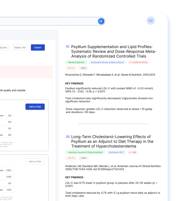
I designed a progressive evidence disclosure architecture — a multi-layered drill-down that allows physicians to inspect any recommendation at increasing levels of specificity, from rapid triage to source verification.
For Longevidence, the architecture composites evidence score with four weighted sub-scores independently inspectable, specific dosage and treatment duration, clinical risk considerations, drug interaction alerts, and a full reference panel linking to primary studies with authors, journals, sample sizes, and trial outcomes. The physician can trace any recommendation from aggregate score → scoring methodology → individual study — a complete auditability chain from conclusion to source.

The evidence display is structured as a drill-down path from conclusion to source. The recommendation card above gives physicians the composite score, sub-score breakdown, dosage, and cautions — sufficient for rapid triage. When a physician needs to verify the basis of a score, the reference panel below surfaces the underlying studies with findings extracted specifically for this biomarker-supplement relationship.


Trade-off
In most B2B SaaS products, reducing complexity is the default priority. In clinical AI, the cost of a physician blindly adopting an unverified recommendation exceeds the cost of a slightly more complex interface. The design deliberately chose verifiability.
Outcome
Physicians can trace any recommendation from composite score to scoring methodology to primary source — a complete auditability chain that enables adoption without requiring independent literature verification. This auditability architecture is applicable to any AI system where expert users need to evaluate autonomous recommendations before acting on them — from investment analysis to security threat assessment to clinical decision support.
4
User Workflow Integration
The design challenge
The final design challenge was workflow coherence: a physician reviewing a complex report encounters dozens of recommendations across multiple biomarkers, each with its own evidence chain. Without careful interface design, this becomes overwhelming — the user gets lost in details and loses sight of the overall clinical picture.
My Solution
The interface must maintain both micro-level detail (individual recommendation evidence) and macro-level context (overall patient status, selected plan so far) simultaneously.

The three-panel layout resolves the micro-macro tension: the left panel provides recommendation-level detail (micro), the right panel maintains patient-level context and running action plan (macro), and the physician's attention can shift between them without losing either context. This layout principle — persistent macro context alongside scrollable micro detail — applies to any AI interface where users make multiple related decisions in a single session.
Outcome
This workflow integration design was validated during physician testing: users completed full multi-biomarker review sessions without requesting navigation changes, and consistently used the Notes field to add clinical context — indicating they had adopted the interface as part of their clinical workflow.
07 From Designer to Fundraising Strategist
What Design Actually Does in a 0→1 AI Company
Outcome
This workflow integration design was validated during physician testing: users completed full multi-biomarker review sessions without requesting navigation changes, and consistently used the Notes field to add clinical context — indicating they had adopted the interface as part of their clinical workflow.