SHUIXIN WANG
GRAPHIC DESIGNER // DIGITAL ARTIST // RISD 2023 //
︎ Information
︎ Soundcloud
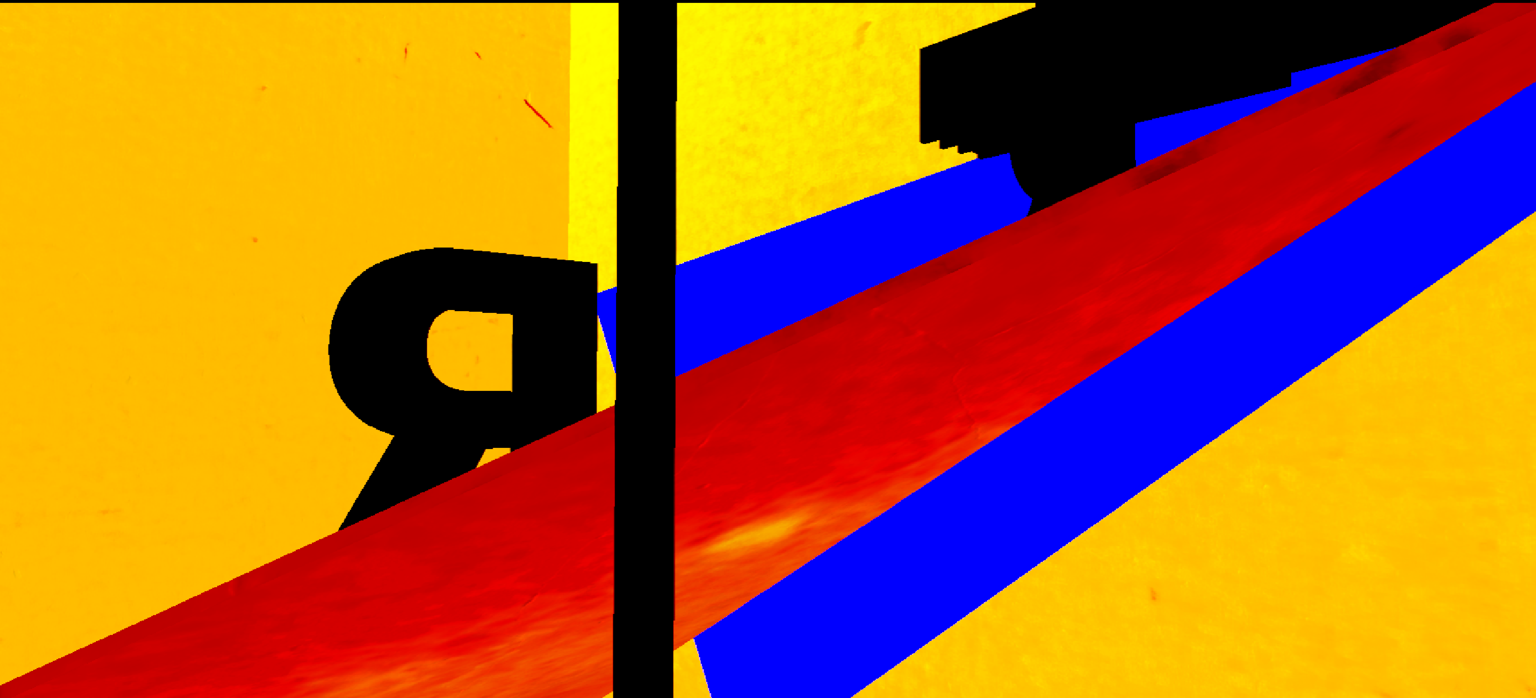
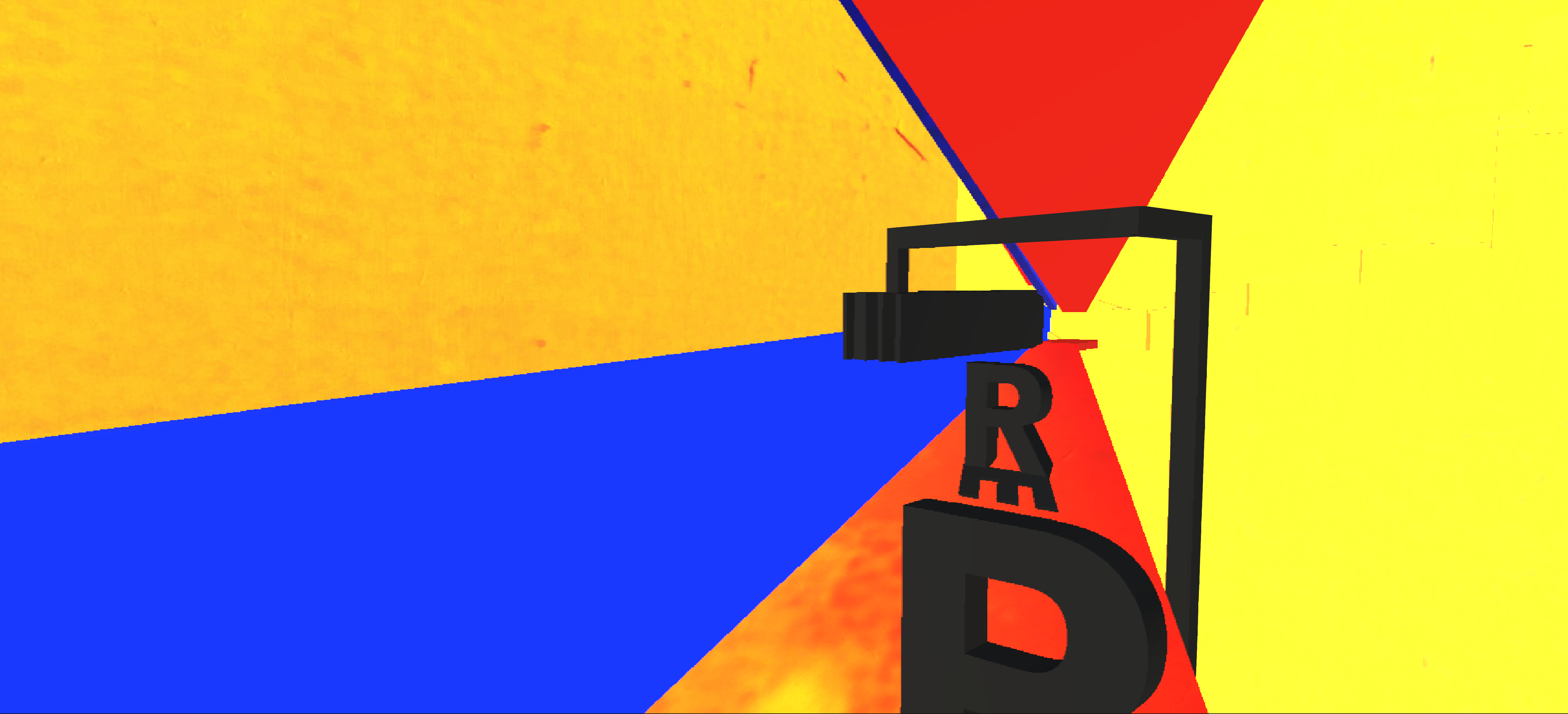
REFRAMING THE SPACE WITH COLORS AND SHAPES
Poster Series // Physical Models // Game Design
10/22 - PRESENT
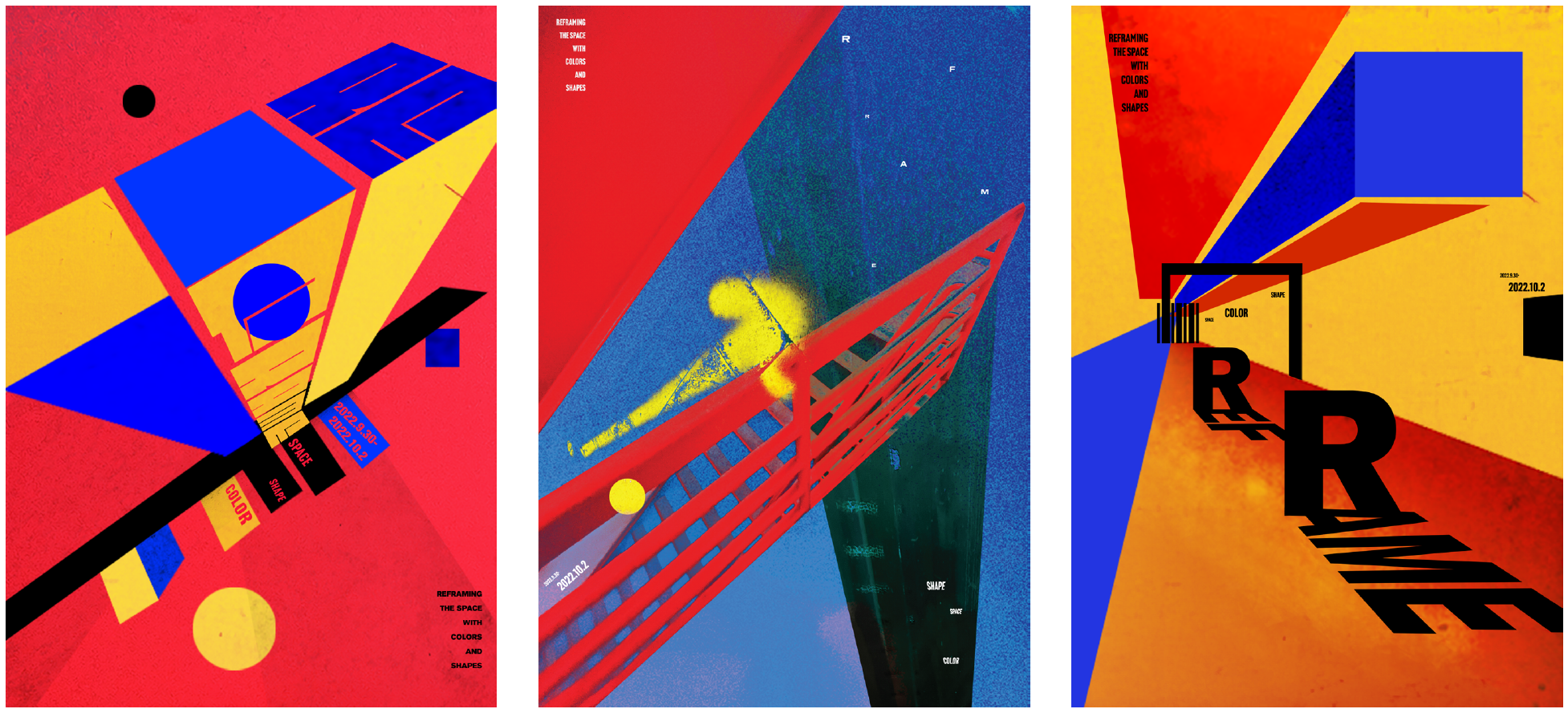
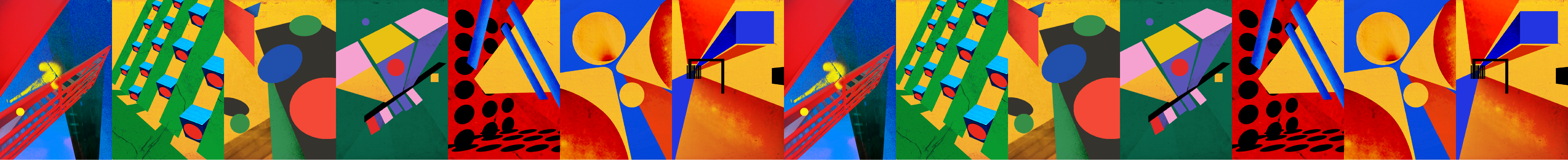
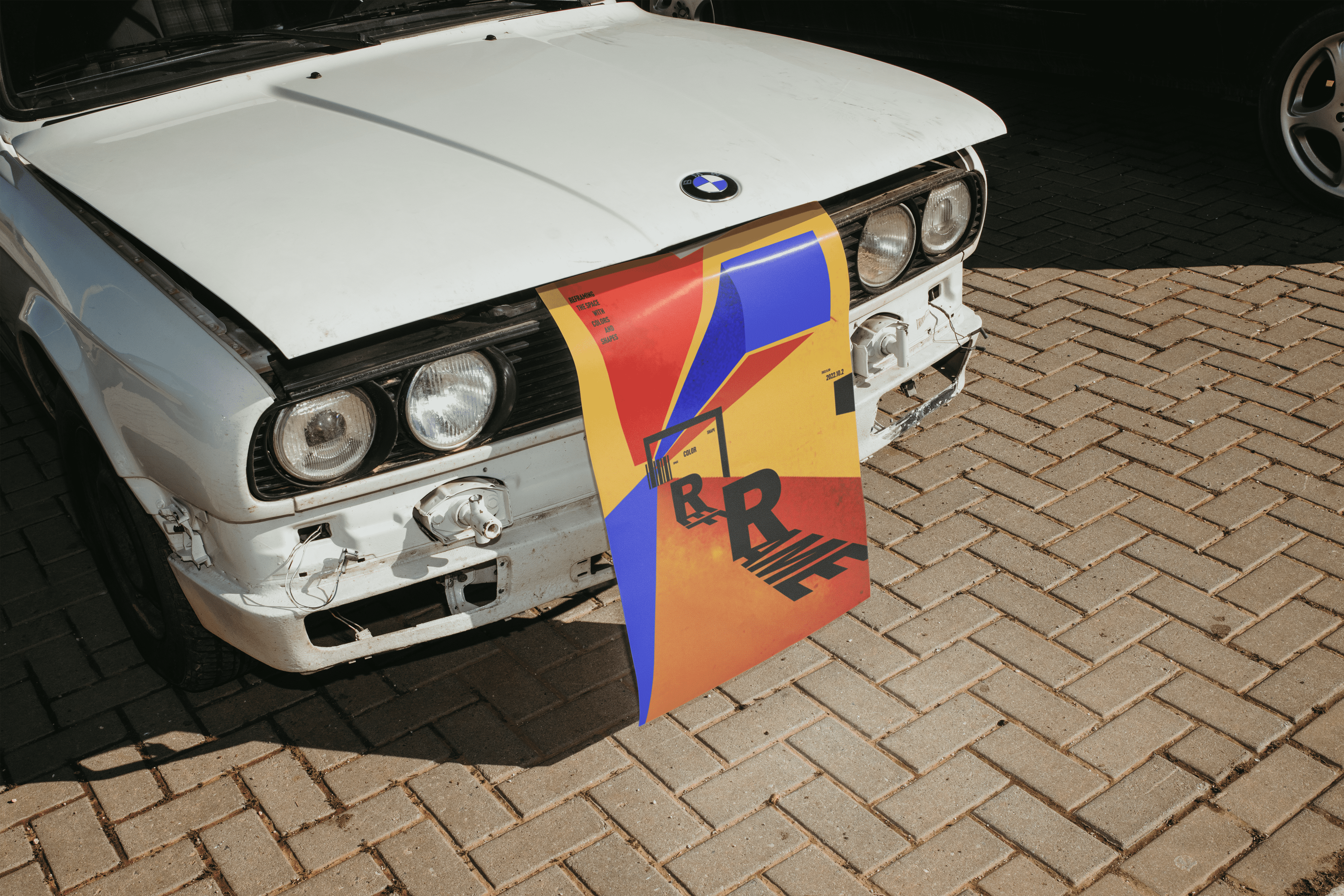
This poster series, titled 'Reframing the Space with Colors and Shapes', is a creative exploration that intersects the realms of photography and graphic design. The series is primarily based on photographs I have captured, subsequently transposed into the realm of graphic design.
Photography, as a medium, transforms the three-dimensional reality we inhabit into a two-dimensional representation, a snapshot frozen in time. As a graphic design student, my discipline largely dwells within two-dimensional space. This raised a thought-provoking question: is it possible to retain a sense of three-dimensionality, akin to that in photography, in a two-dimensional graphic design context, without directly employing the photographs themselves? In response to this query, I sought to experiment with simple graphics and primary colors to reproduce and encapsulate the spatial essence inherent in the original photographs.
The creative process for 'Reframing the Space with Colors and Shapes' began with the selection of photographs featuring compelling perspective angles. From there, I traced the landscape, replacing natural and man-made objects within the scene with geometric shapes. The palette of primary colors and textures used in the series are also extracted from my photographic portfolio, thus ensuring a cohesive visual language.
The title of the series, explicitly embedded within each poster as 'REFRAME', underscores the conceptual theme of 'reframing space'. The design of the central poster intentionally deviates from the others through the addition of a blurred-edged arrow and a noise-filled background. This creative choice emerged when I recognized an unintentional parallel between my style and that of the iconic Bauhaus design tradition. I felt the need to disrupt this familiarity, to provide a visual pause or breathing space for the viewer. Nevertheless, the continuity in the use of red, yellow, and blue throughout the series ensures a unifying aesthetic thread.
Moreover, I have consciously utilized typography not just as a peripheral element, but as an integral component that contributes to the overall sense of space within each poster. Rather than allowing typefaces to exist merely as bystanders, they have been intricately woven into the designs to further intensify the spatial dynamics
Moreover, I have consciously utilized typography not just as a peripheral element, but as an integral component that contributes to the overall sense of space within each poster. Rather than allowing typefaces to exist merely as bystanders, they have been intricately woven into the designs to further intensify the spatial dynamics
在《以颜色和形状重塑空间》的海报系列中,我探索了摄影与平面设计的有趣交汇。这一系列基于被精选的透视丰富的照片,将这些定格的时刻重构为二维的设计。通过形状、颜色和质感的巧妙运用,我在平面中再现了照片所捕捉的空间深度。此系列深入探讨如何利用几何形状、色彩和材质在平面上创造出空间和三维的效果。
“重构”(REFRAME)是本系列的核心概念。我对选定的照片进行了解构,并使用几何元素来替代其内部的有机和建筑结构。在系列清晰、锐利的图形中,第二幅海报却采用了边缘模糊的黄色箭头,打破了传统包豪斯的设计规范,为整个系列注入了更多活力和变化。三幅海报统一采用的原色调则确保了整体的连贯性、和谐和审美统一。 每一张海报中的元素——不论是构图、色彩还是质感——都取自照片,扎根于现实。
“重构”(REFRAME)是本系列的核心概念。我对选定的照片进行了解构,并使用几何元素来替代其内部的有机和建筑结构。在系列清晰、锐利的图形中,第二幅海报却采用了边缘模糊的黄色箭头,打破了传统包豪斯的设计规范,为整个系列注入了更多活力和变化。三幅海报统一采用的原色调则确保了整体的连贯性、和谐和审美统一。 每一张海报中的元素——不论是构图、色彩还是质感——都取自照片,扎根于现实。
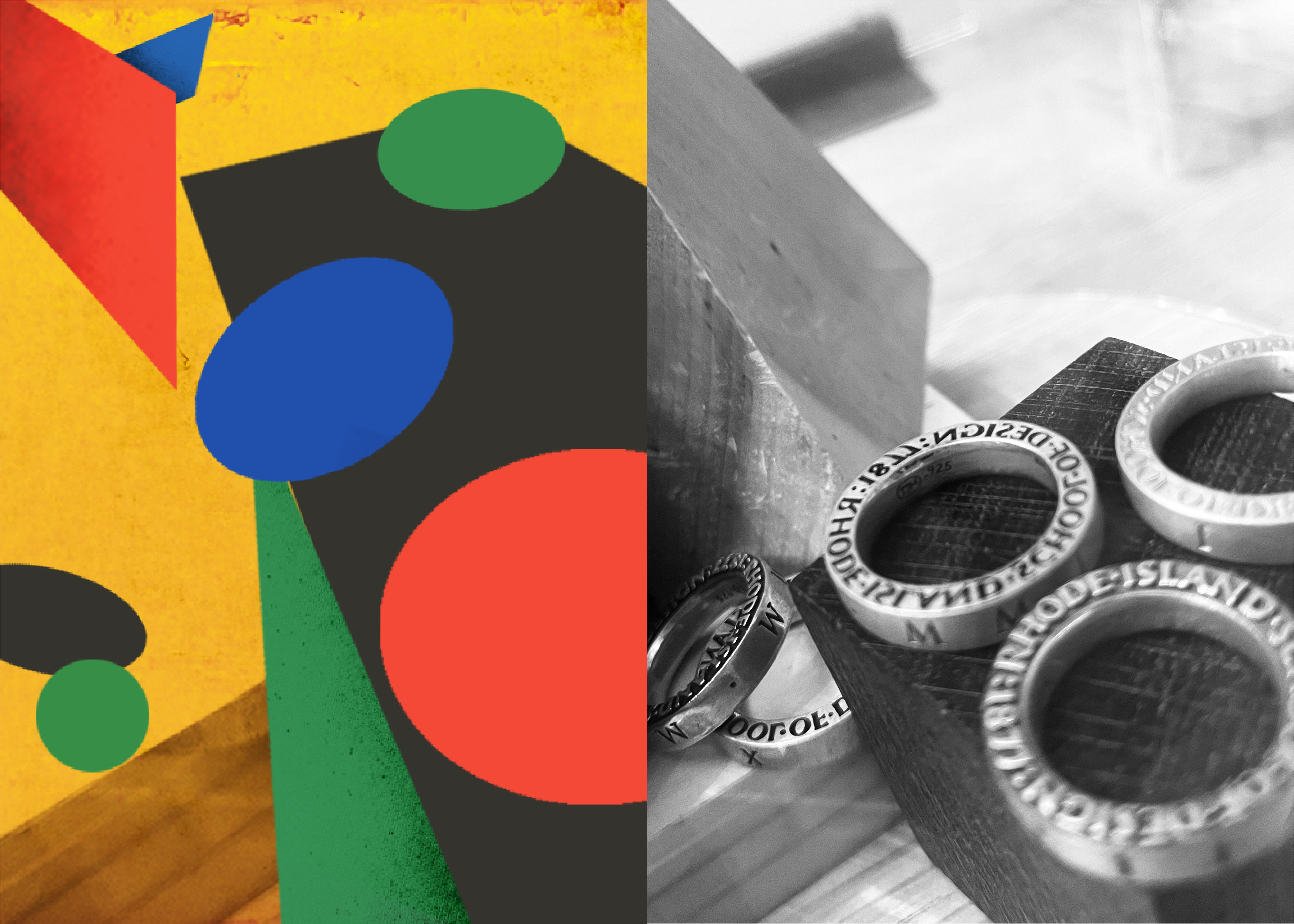

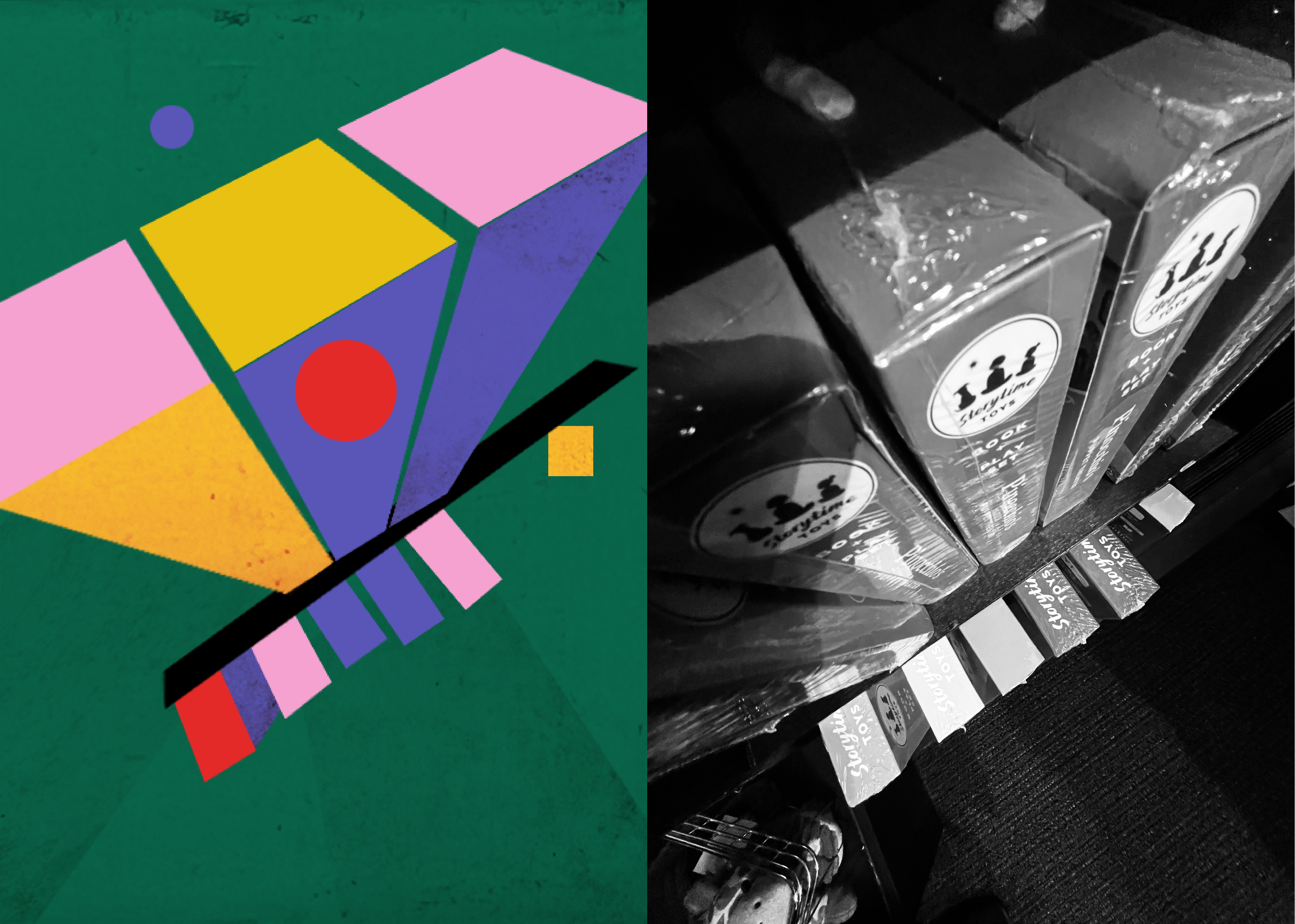
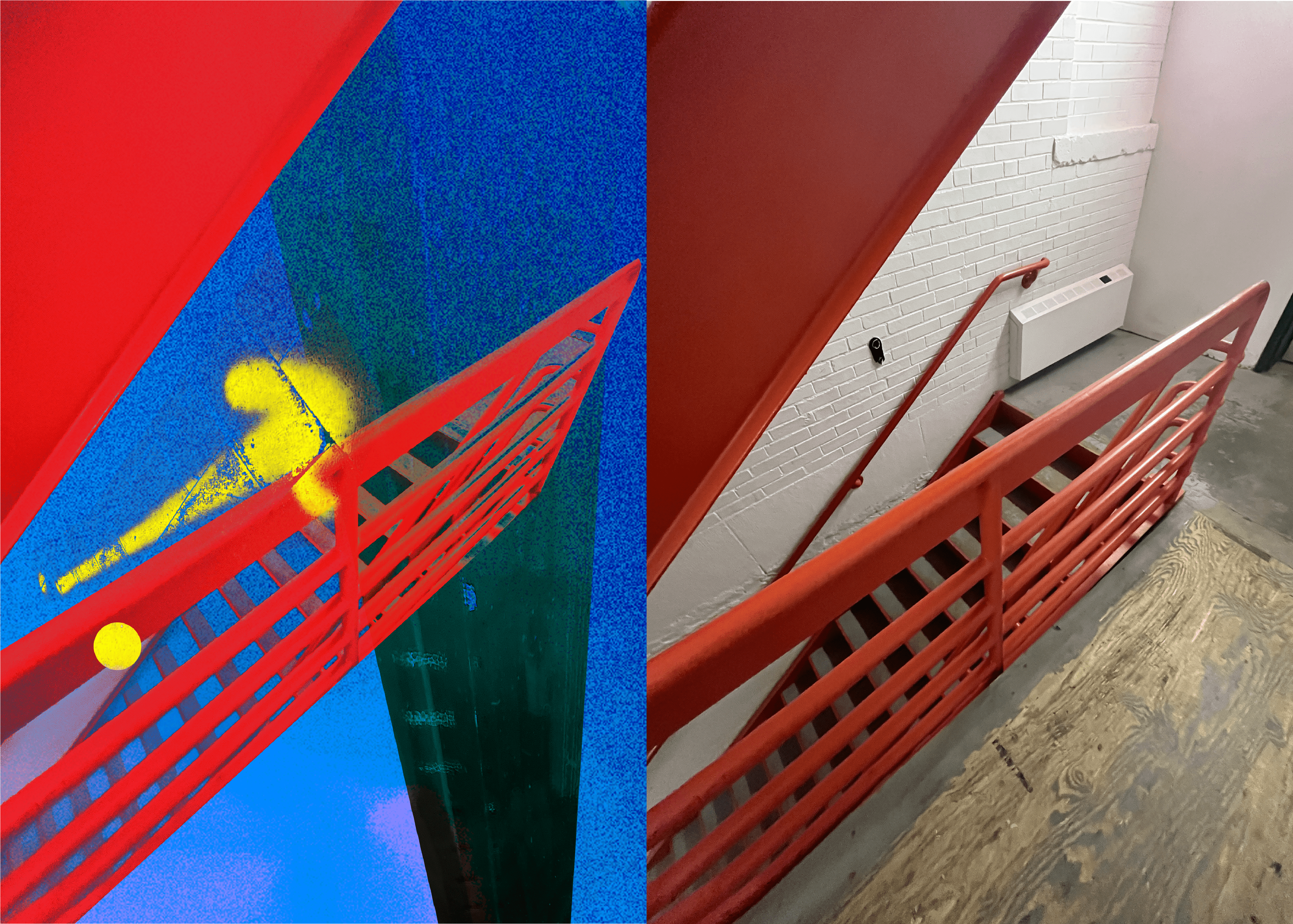
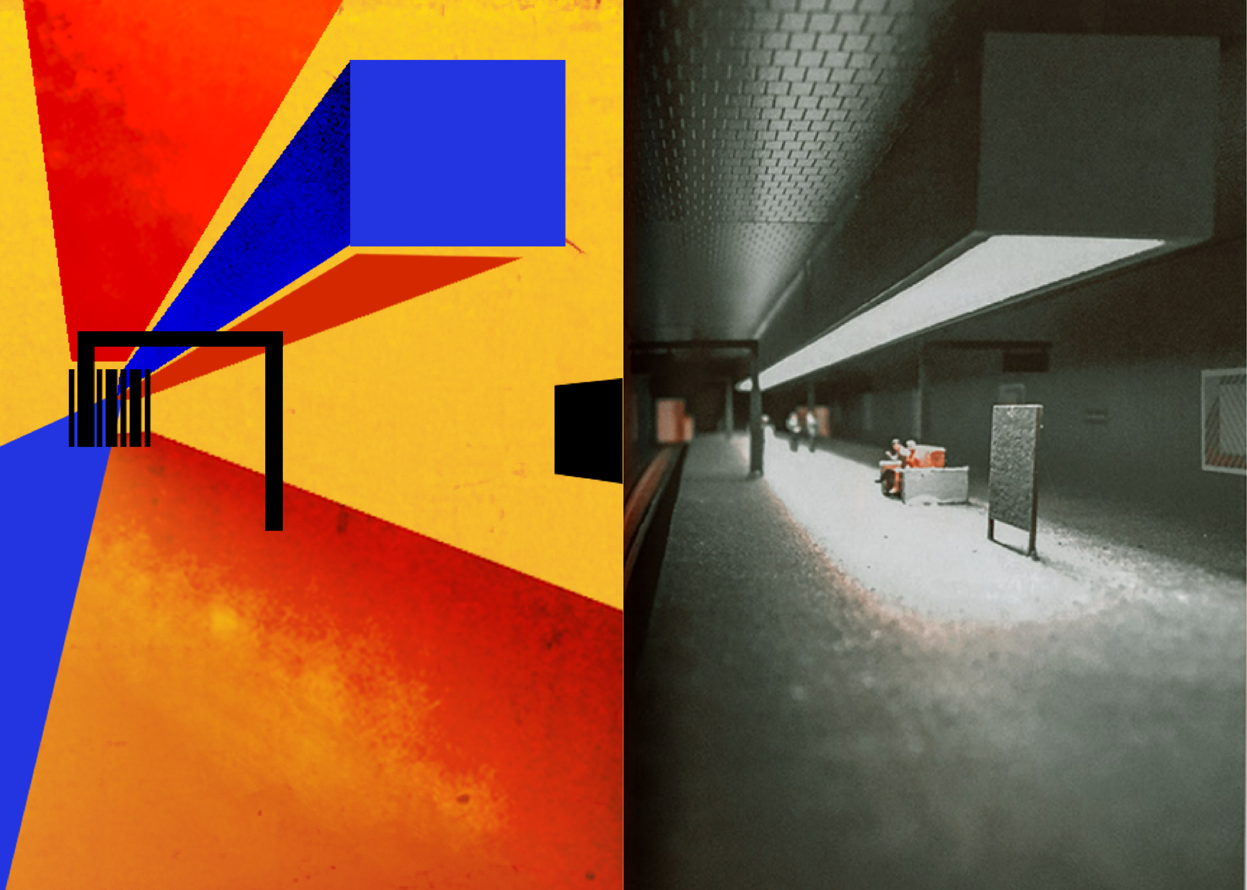
The photo on the right is one I gathered on the Internet, taken by an unknown author.
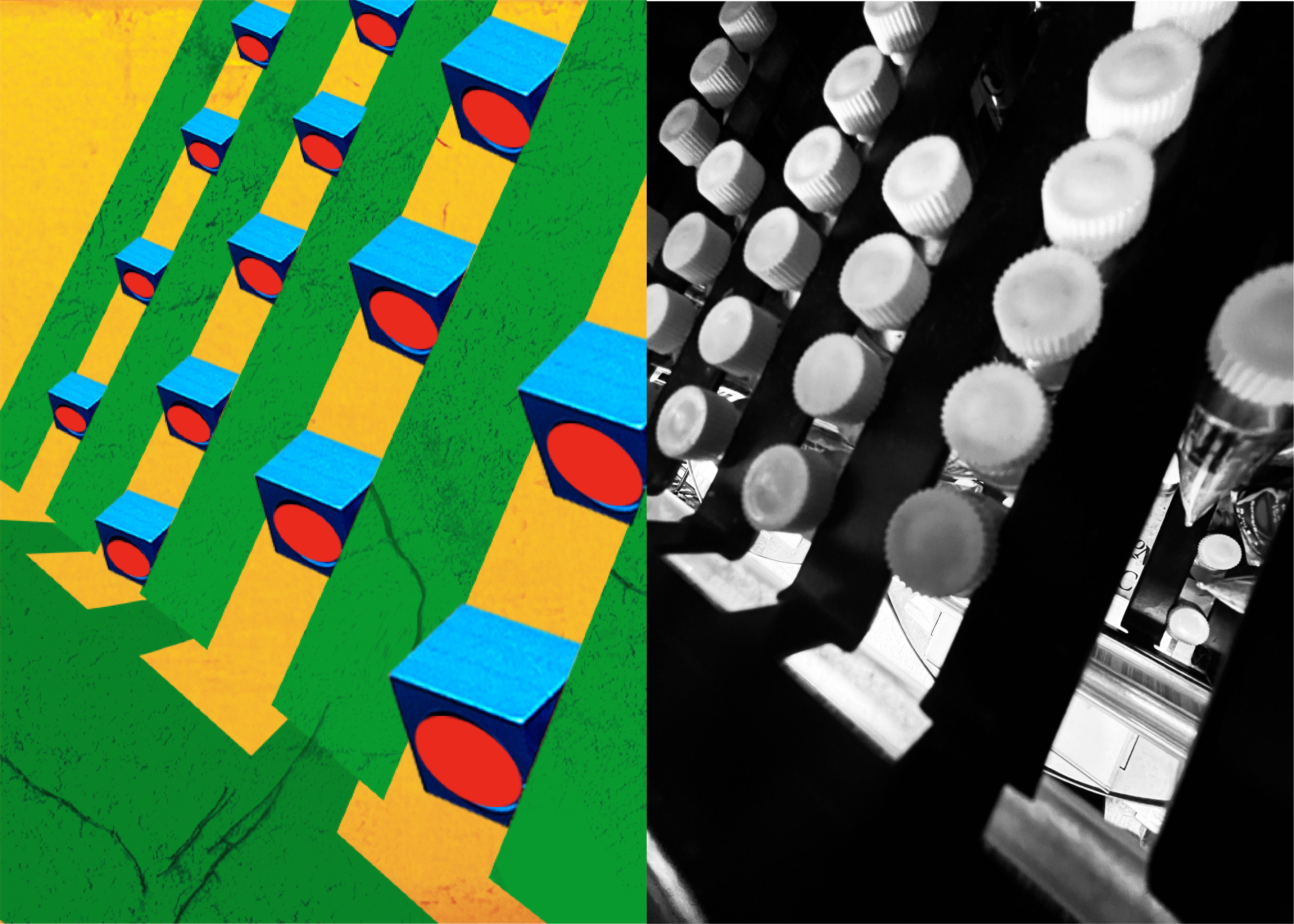
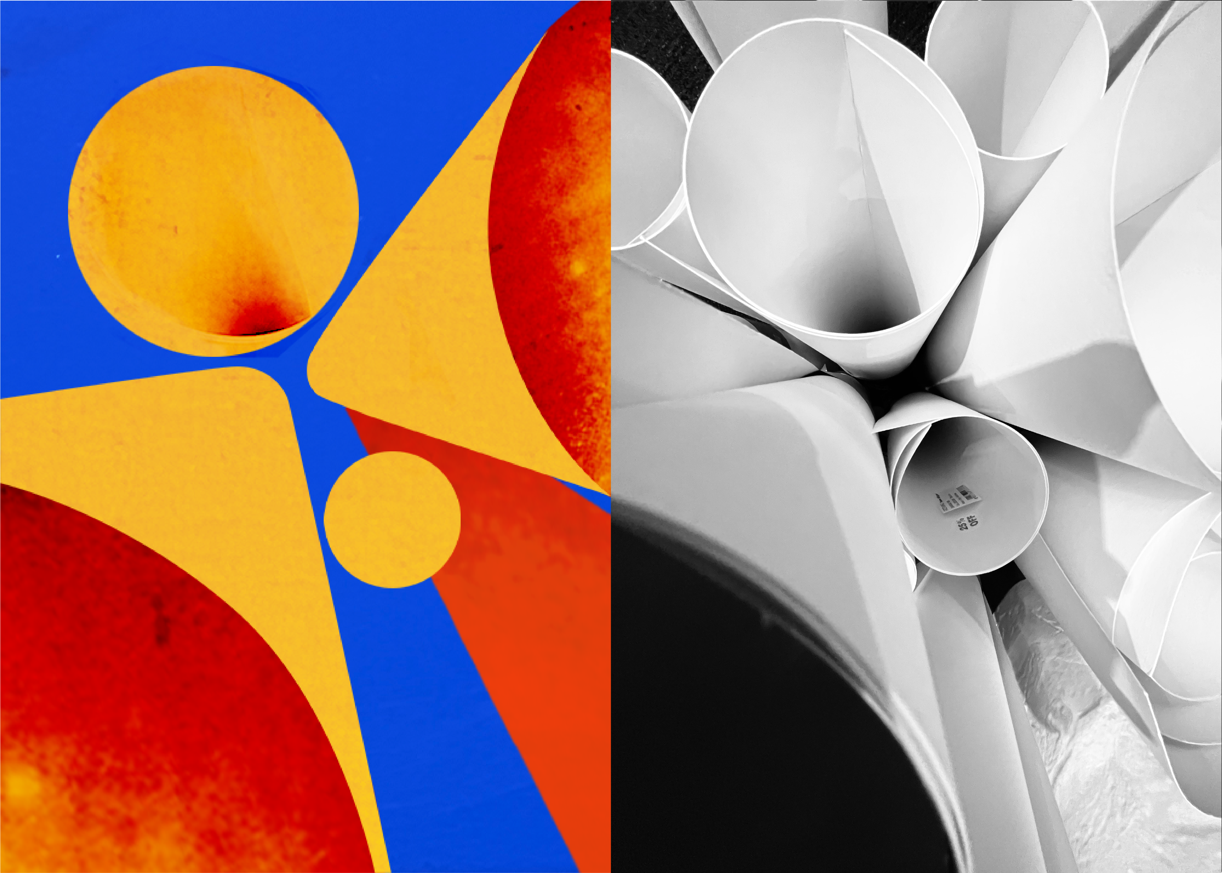
Here are some drafts and the photos they are based on. You can discover the connections between the images on the l
eft and the photos on the right, but at the same time, you will also feel the different senses they convey."
这里列举了一些草稿与它们基于的照片。您可以发现左侧图像与右侧照片之间存在的联系,但同时,也将感受到它们带来的不同感觉。

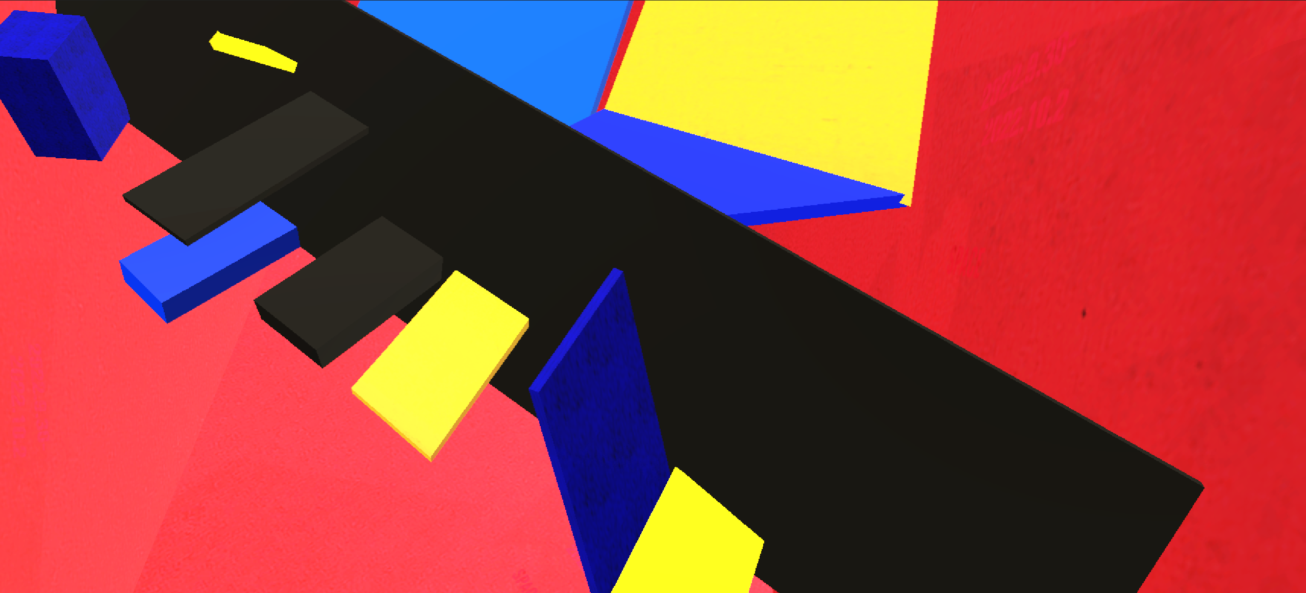
PHASE 2: Models Made of Acrylic Board
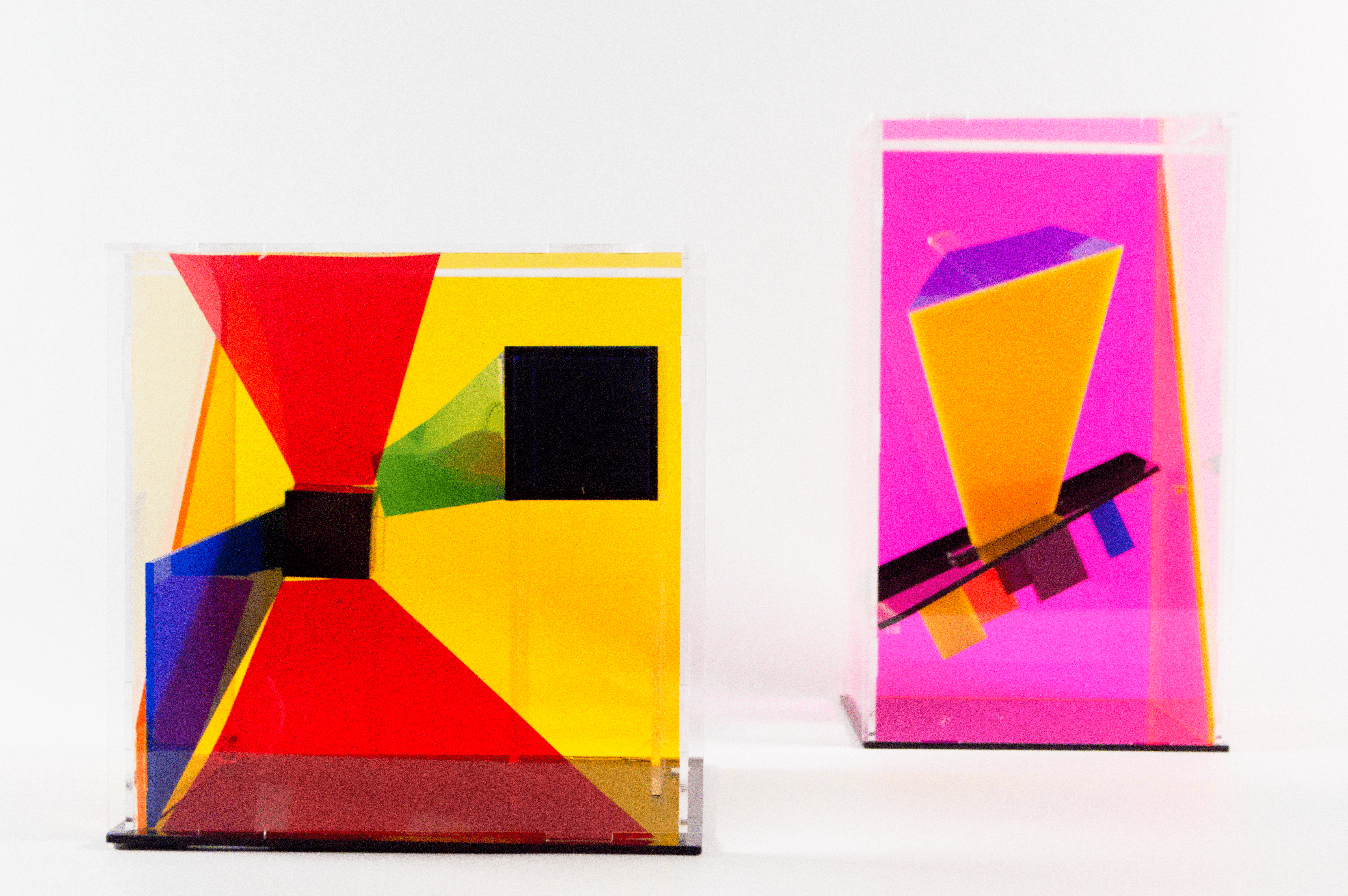
In the second phase, I created two models based on the posters. Using their eyes as viewfinders, the audience can observe the models from different angles, and the images of the models and their projections in their eyes change accordingly, further emphasizing the concept of "Reframe."
在第二阶段,我制作了两个基于海报的模型。观众以双眼为取景器,随着他们观察模型的角度变化,眼中模型及模型的投影构成的图像也在变化,进而继续强调”Reframe“这一概念
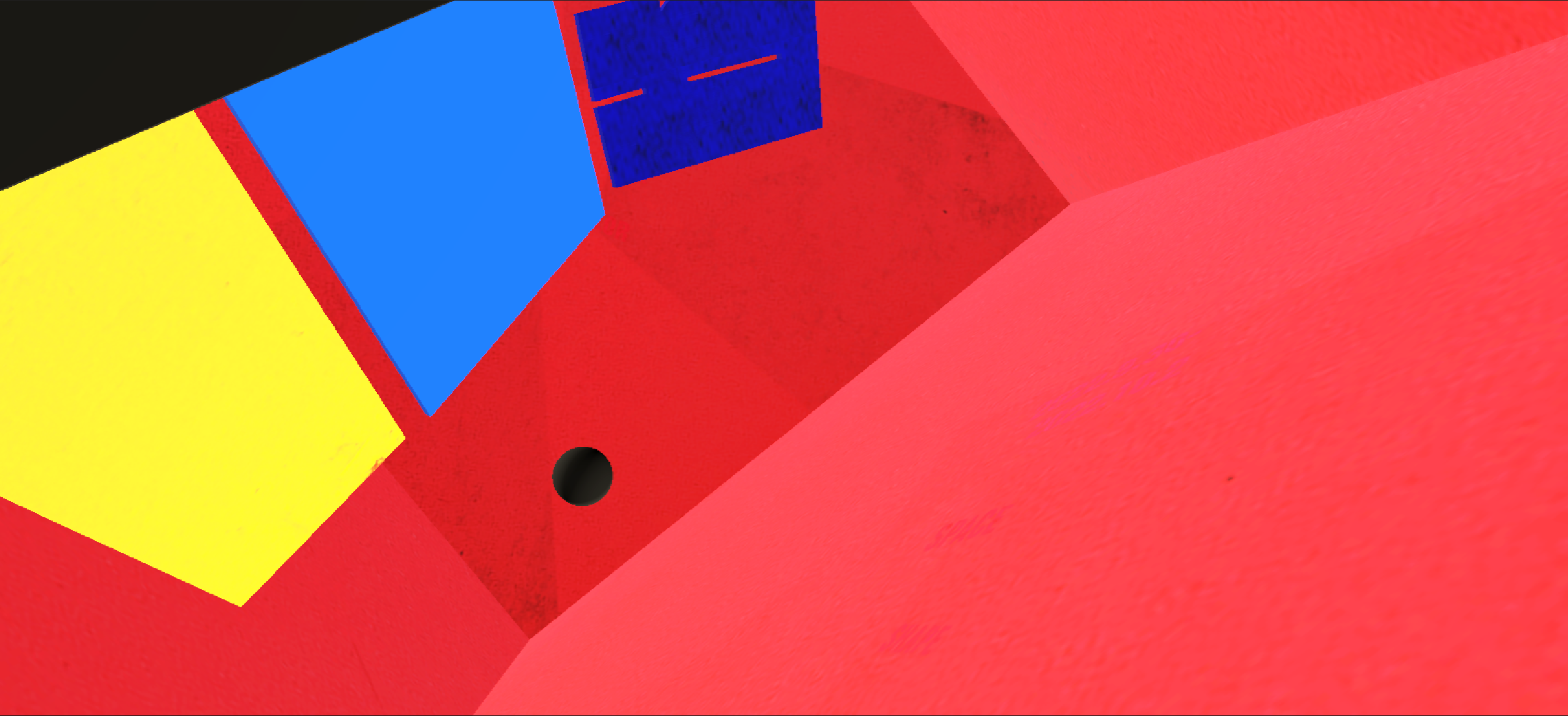
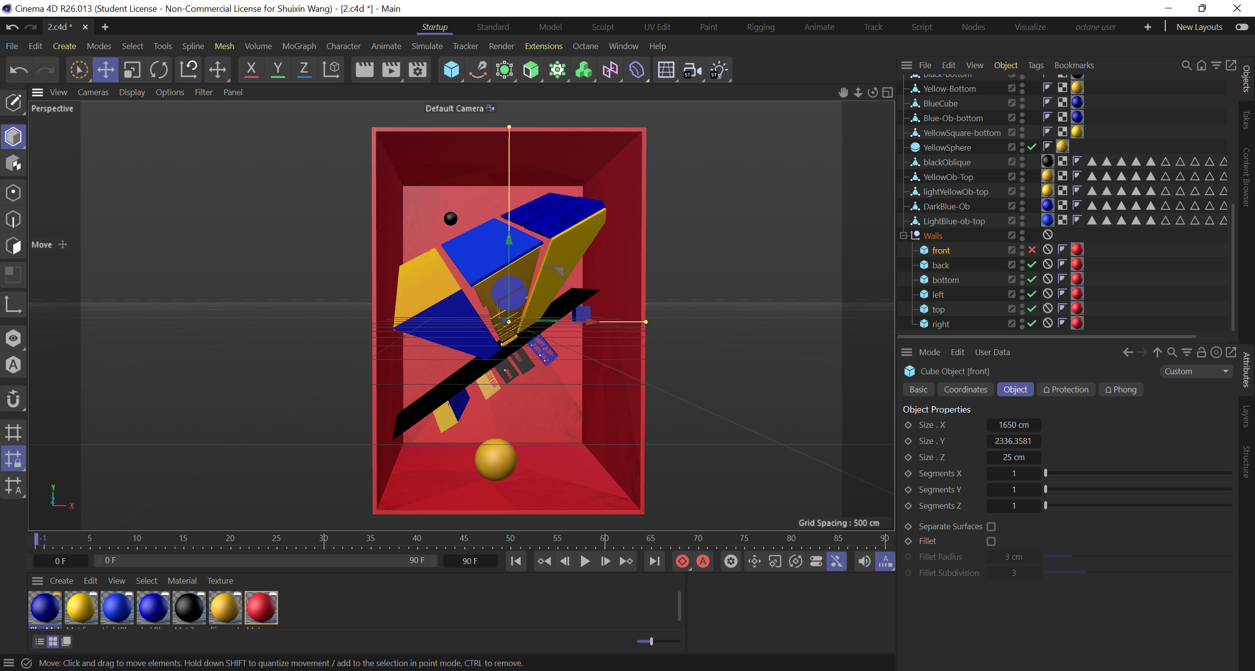
PHASE 3: Game Design
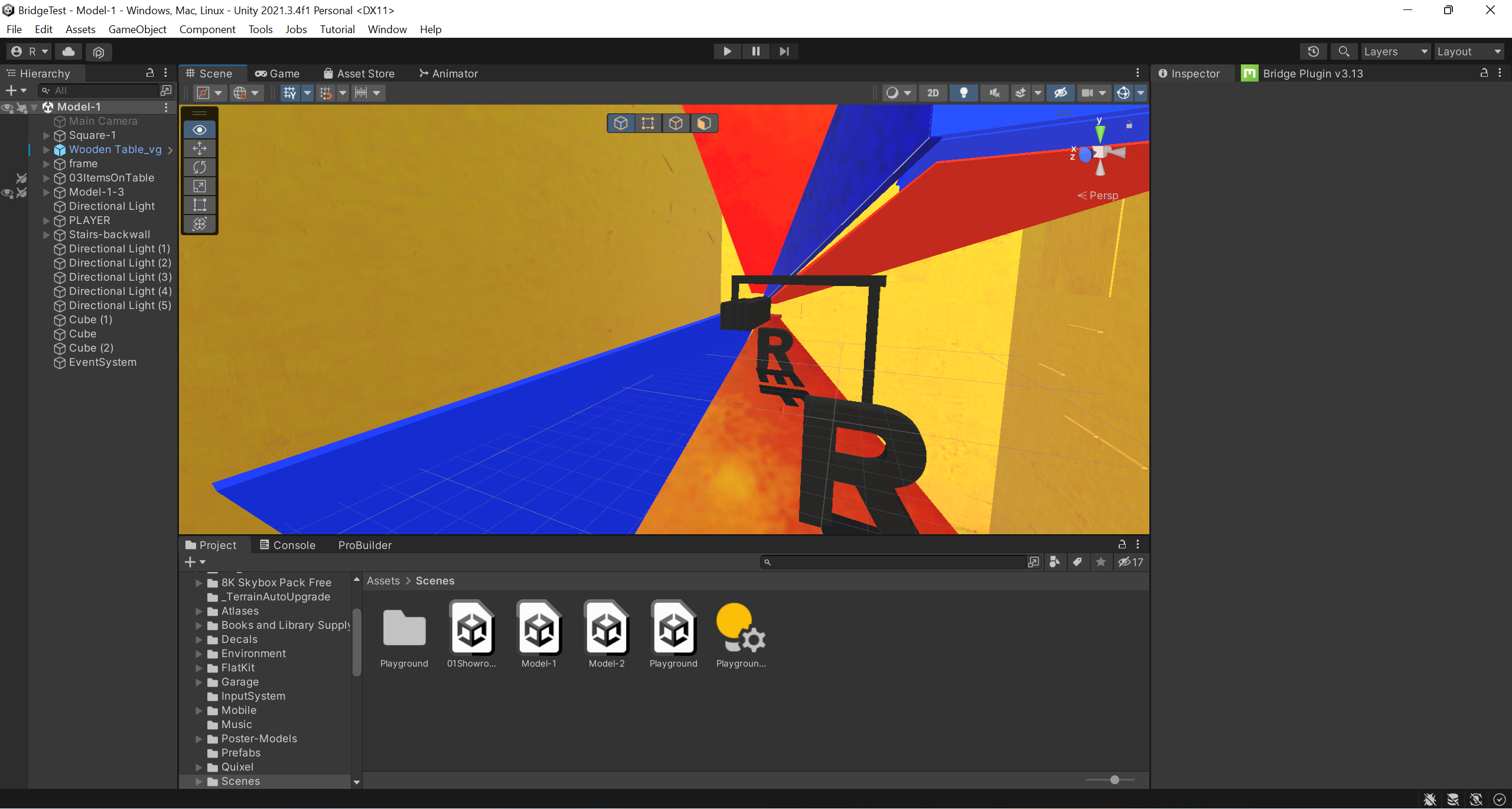 screenshots of the game in Unity
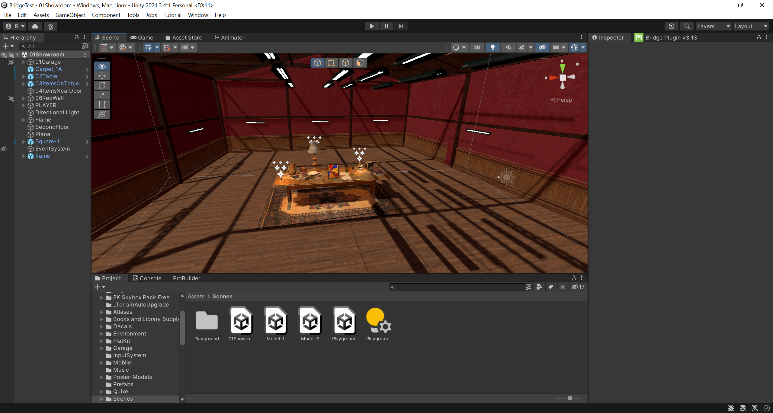
In the third phase, I turned the posters into 3D models and created an exploration game in Unity. Going beyond the previous concept of "using simple graphics and primary colors to reproduce the spatial sense of the photos," in this stage, I wanted the audience to refocus on my posters, personally walking in them, getting closer, and climbing the elements in my posters, and experiencing the impact of graphics and colors on space from a free perspective.
在第三阶段,我将海报制作成了3d模型并在Unity中做了一个探索游戏。超脱于先前“意在使用简单的图形与primary colors重现照片所具有的空间感“ 的概念,在这个阶段,我希望观众重新着眼于我的海报,亲自行走于我的海报当中,接近、攀爬我海报中的元素,以自由的视角感受图形与颜色对空间的影响。


screenshots of the game while playing
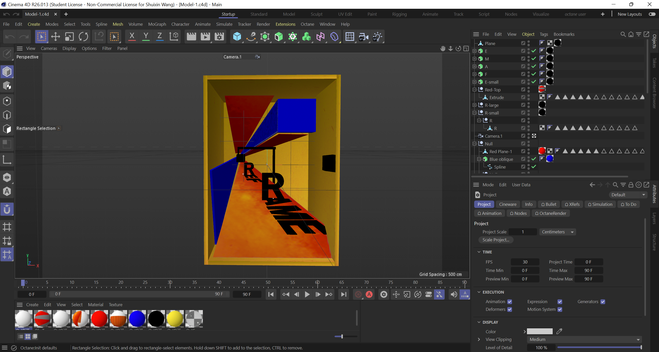
screenshots of the game in Cinema4D
Now, I have only created two models. In the future, I want to continue developing this game and include my previous sketches. I hope players can travel through each poster and experience different graphic worlds.
现在我只制作了两个模型。在将来,我想要继续制作这个游戏,并把我之前的草稿加入其中。我希望玩家能在每一个海报中穿梭,感受和体验不同的图形世界。
SEE YOU IN THE FUTURE